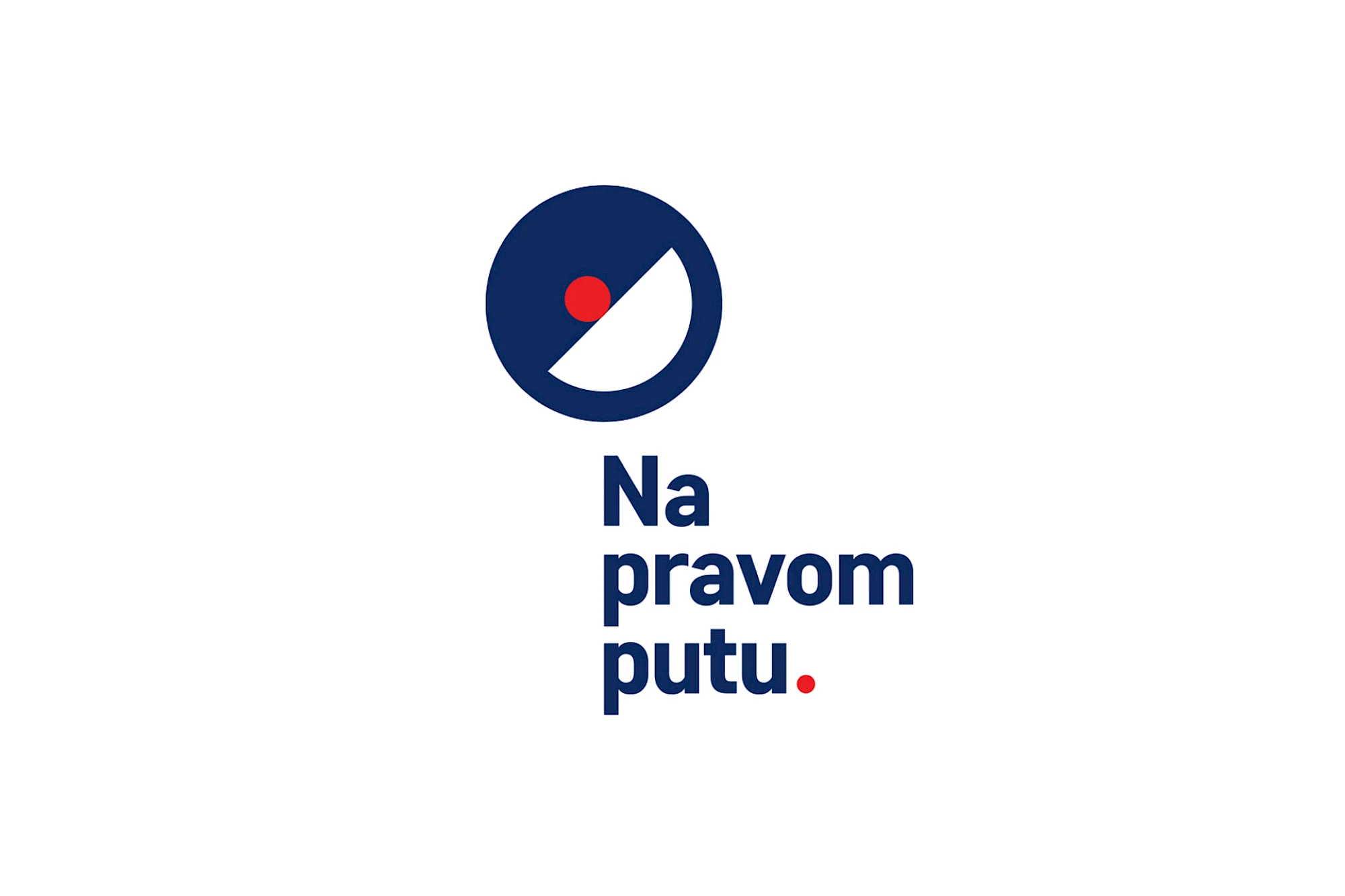
Na pravom putu translates direction into a simple circular sign: a strong diagonal path, an open white field and one red point of focus. The symbol avoids literal arrows, giving the idea of movement a more ownable and flexible form.
The graphic design pairs that sign with compact navy typography and a precise red accent. The result is direct enough for campaign communication, yet structured enough to remain consistent across print, outdoor and digital formats.
Gallery
All project images are served through ProcessWire image variations with WebP URLs when available.





More work
Related archive items from the same portfolio collection.